Creating an engaging credit card comparison experience
Creditcards.com is an industry leading marketplace and educational resource for consumers looking to get a credit card. Through extensive user research, my team found that consumers needed a way to compare credit card offers, benefits and details and a simple to use tool.


My Role:
Lead designer, creative manager
Team:
1 Designer, 1 Researcher, 1 Writer, 1 PM, 3 Engineers
Duration:
6 months
Business goal
Creditcards.com wanted to improve top of funnel engagement by giving users the ability to compare the many different type of credit cards in their marketplace.
By giving users this type of functionality, we believed that this would have a direct impact on conversion as it would make users feel more comfortable applying for a card that was right for their unique financial situation.
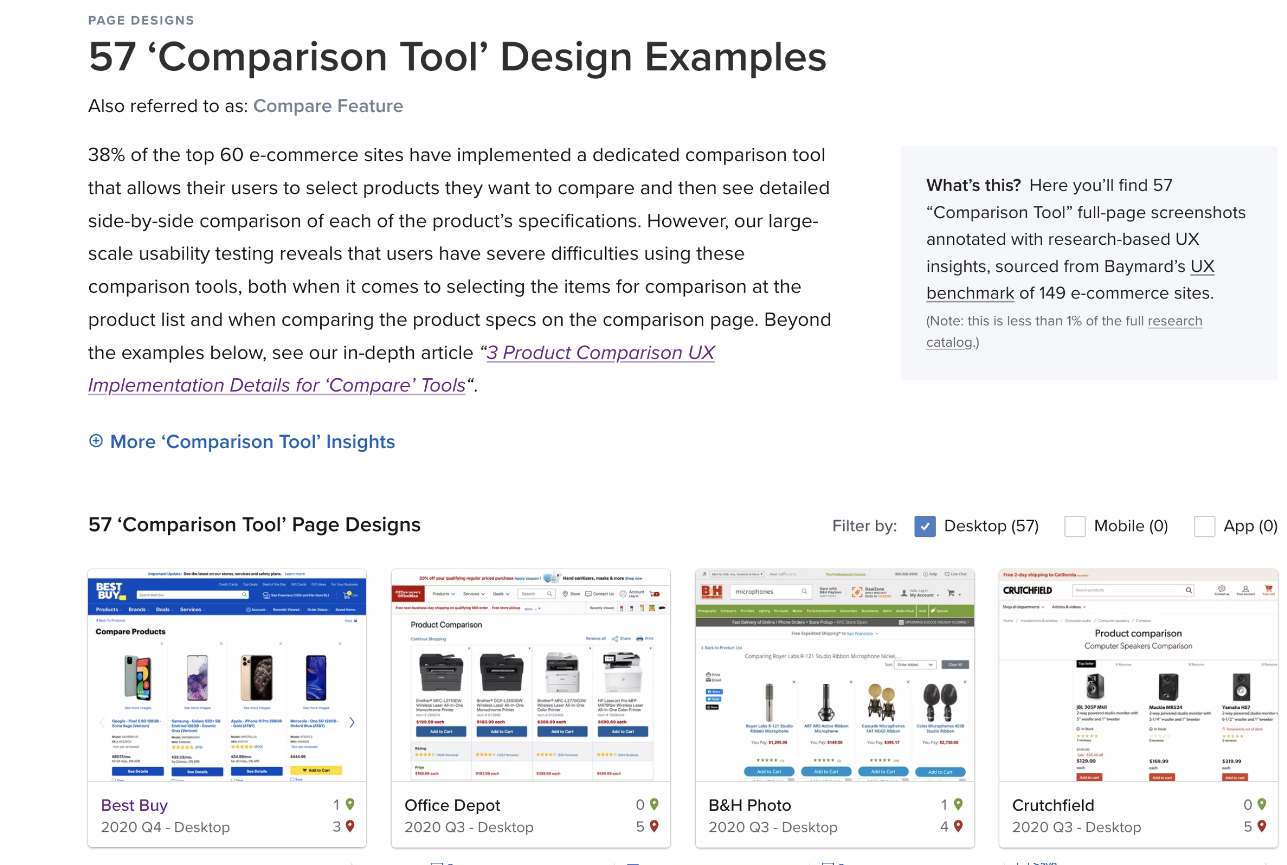
Focusing on best practices
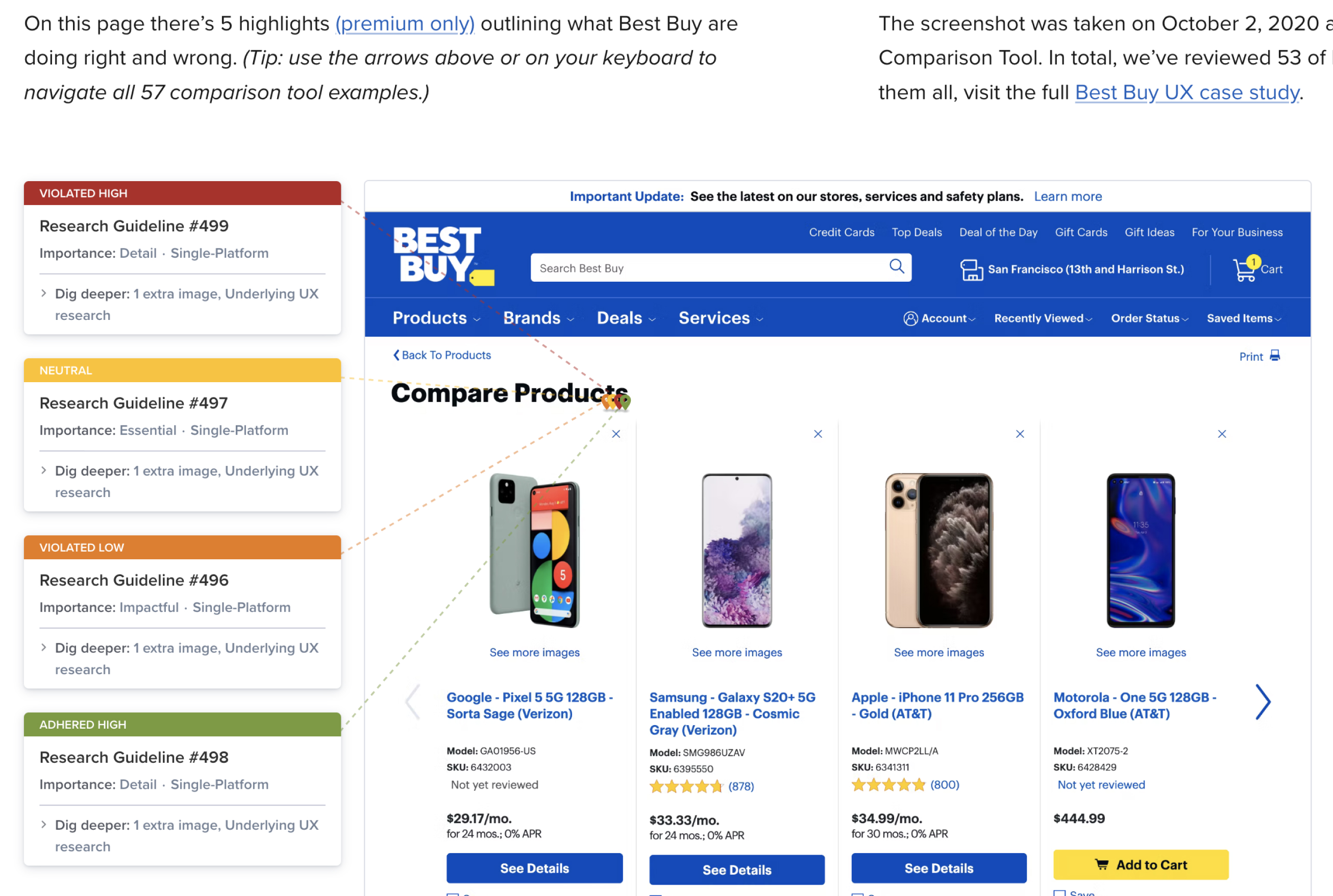
To kickoff the project, the team wanted to make sure we were utilizing industry best practices when crafting our comparison experience. Working with our lead UX researcher, we compiled research from the Baymard Institute and presented it back to the business team to get buy in on the direction we wanted to go with our comparison experience. This helped the team align on a clear direction and enabled the creative team to get started on wireframing out an experience.
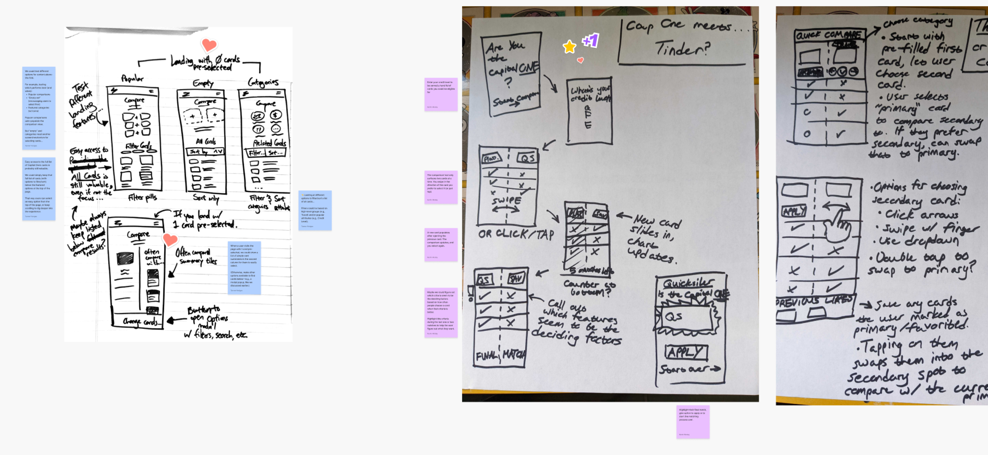
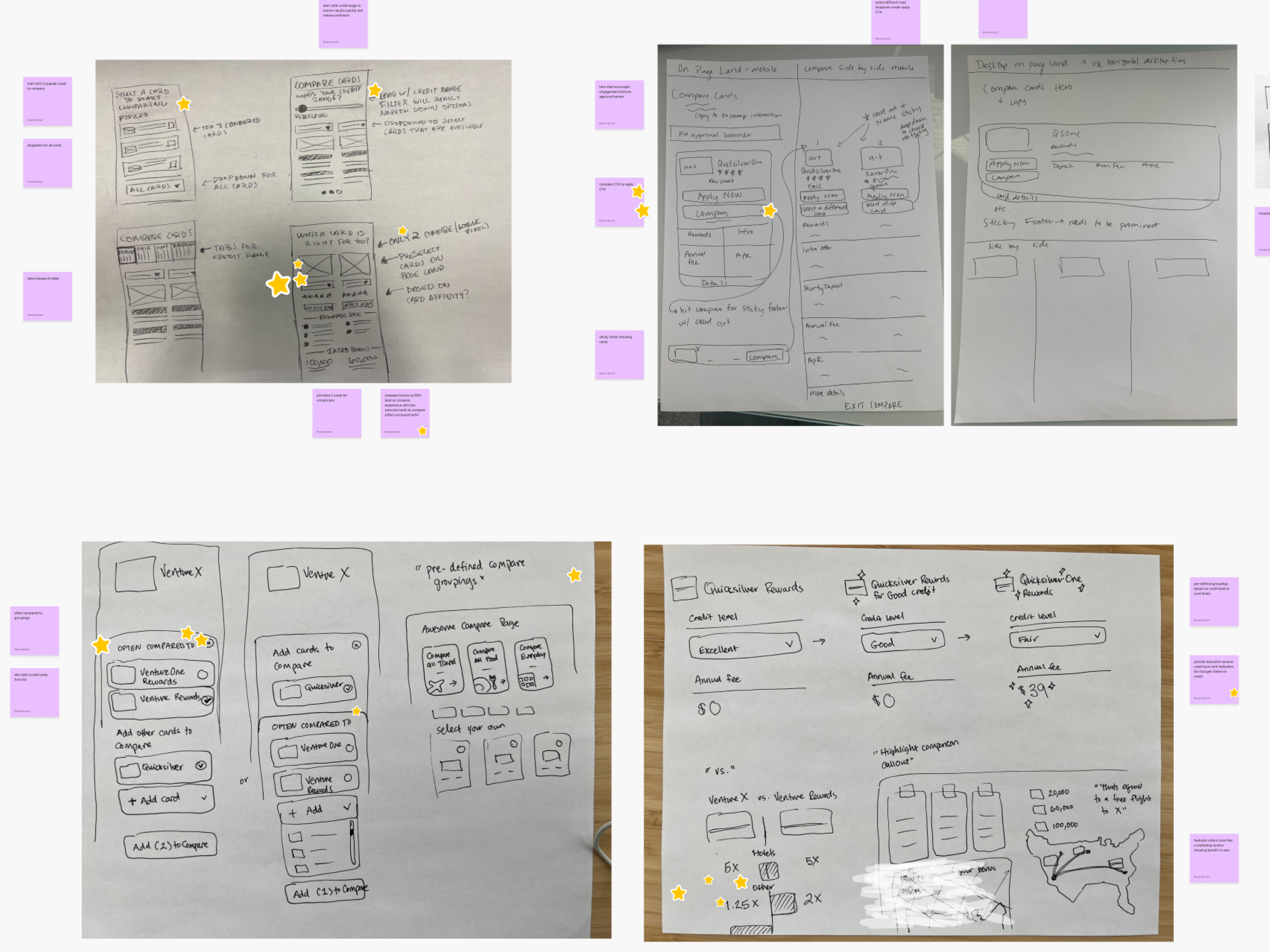
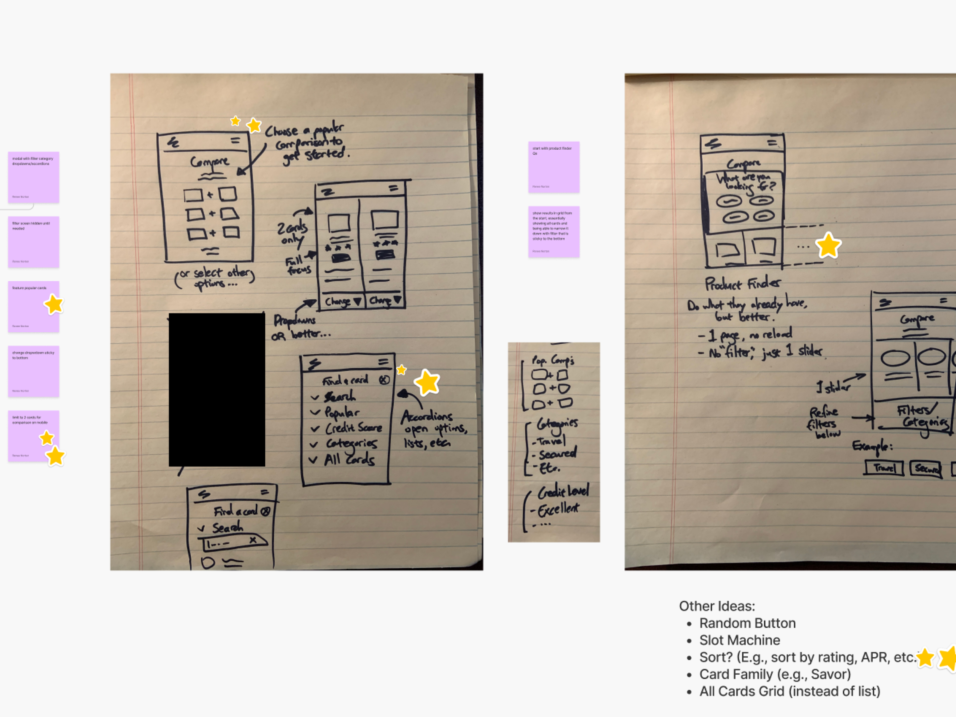
Establishing a direction with co-creation
To kickoff the project, we needed to make sure we were aligned as a team on the direction we wanted to take this tool so I facilitated a co-creation sprint with FigJam and invited stakeholders from various functional groups to collaborate on a solution together. After multiple rounds of sketching and voting we had a north star to follow as we began to conceptualize the tool.
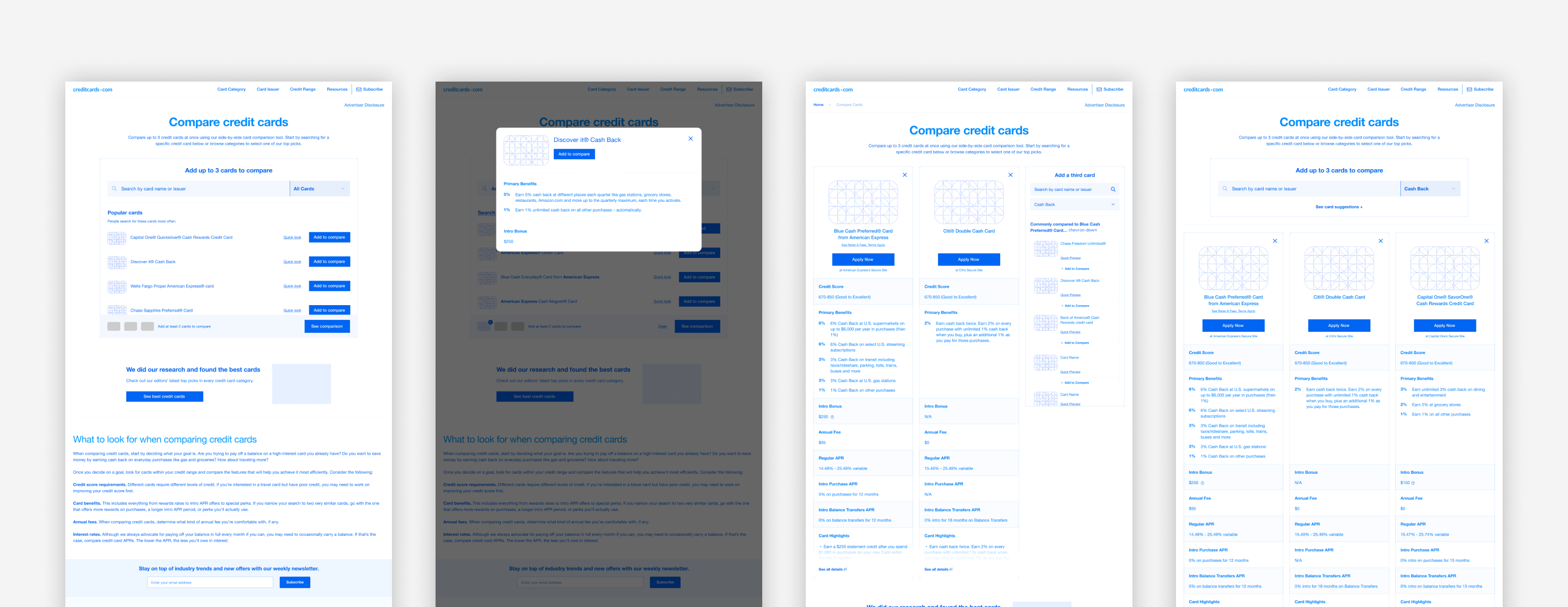
Getting early feedback from users
After getting buy in from the business team, the creative team began to create wireframes based on the best practices discovered through our research. After getting a general concept wireframed and a prototype created in Figma, we worked with our UXR team to do some unmoderated usability testing with usertesting.com to find any issues with our user flows and to make sure our information architecture made sense.
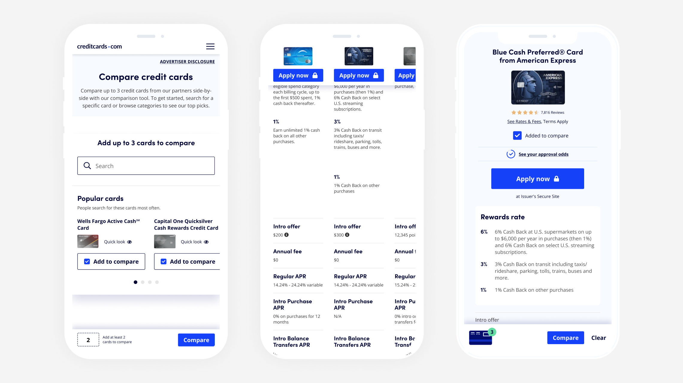
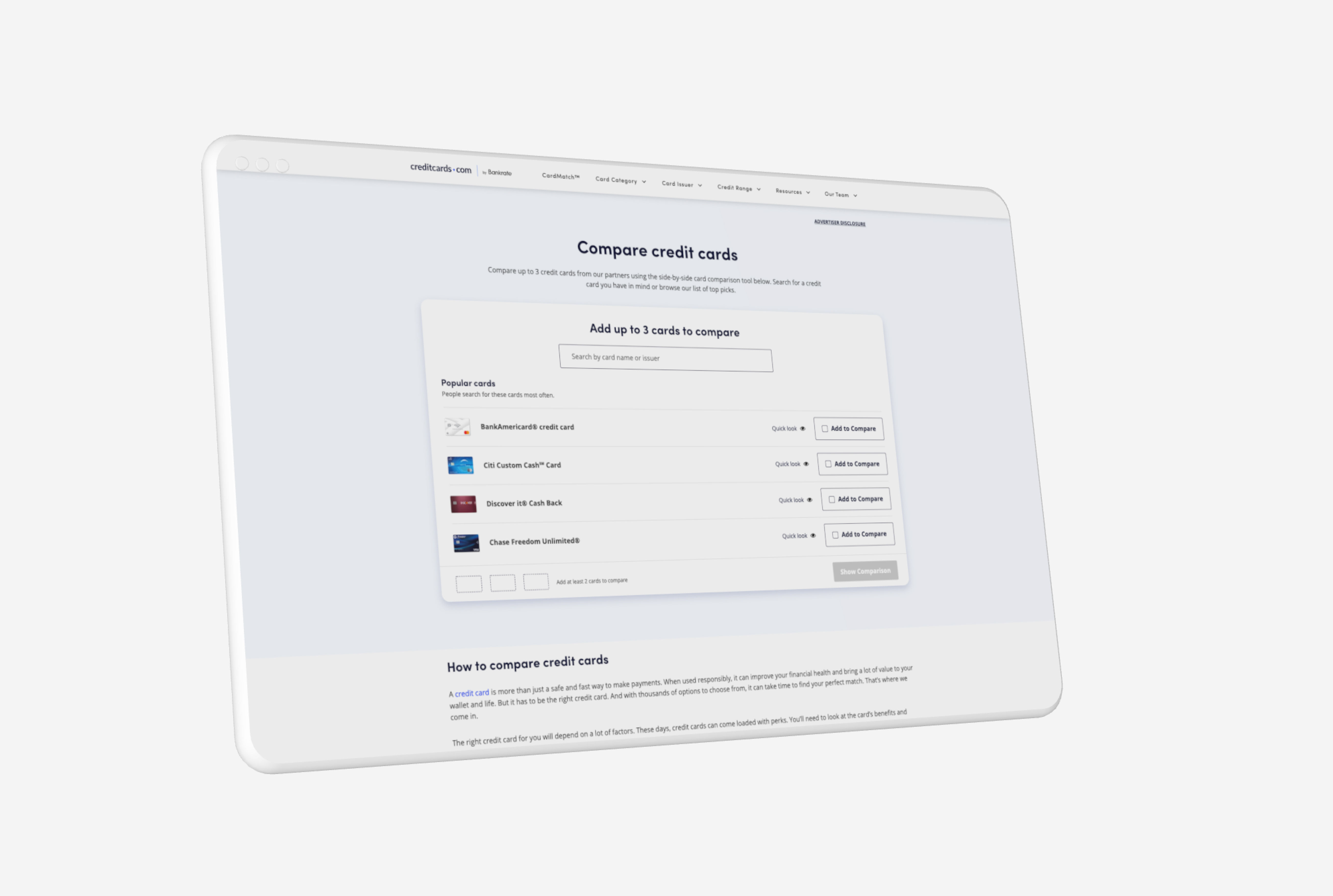
Applying styles and creating the final product
After conducting user testing, my team got some great actionable feedback from users that we then used as we applied our established design system to the wireframes. The final product designs were then presented back to the broader team and once approved we began to work with the engineering team to build out the final product.
.jpg)